This is a small but important Business UX idea and I’ll try to keep it short. It builds on the concept of the upside-down homepage and other articles I wrote about copywriting and UX lead generation patterns related to the homepage in particular.
The map of your entire business has a new home: the footer of your website.
Take a moment and go look at your site’s footer. Now ask yourself, “is everything that is important, interesting, or useful about your business easy to find here?”
There are infinite ways to do this, but below I depict a pattern common to B2B knowledge businesses. (You’ll have to set your email client to display images to see this below)
 I’ll walk through mechanics here because this isn’t just the upside-down model, where the header and main menu switches roles with the footer. Why not? Because the footer is, of course, never space-constrained.
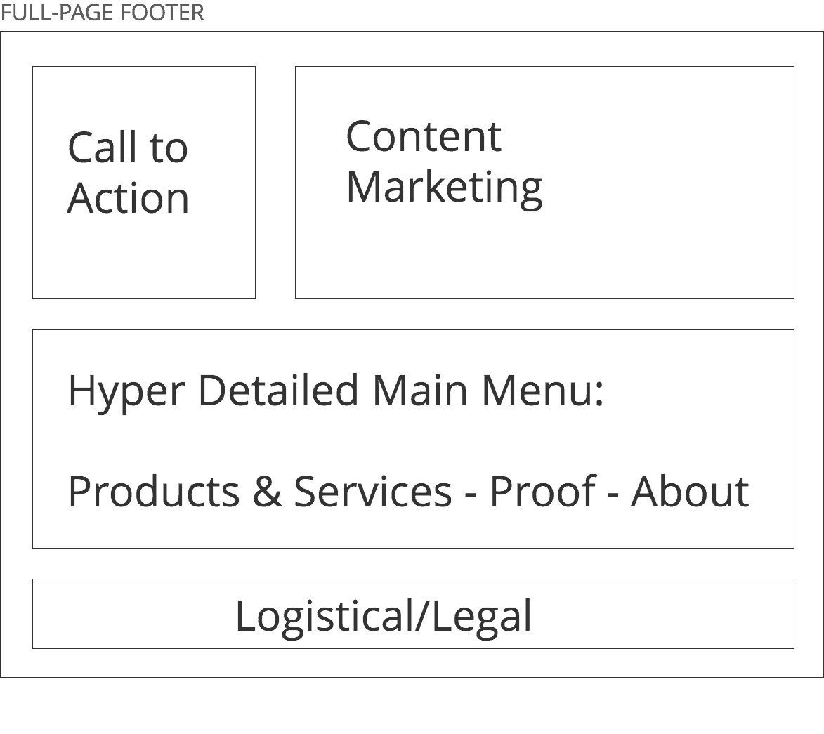
In fact, your footer should occupy an entire viewport on the most common viewport of your customer. In other words, if you view your site on most laptops, and scroll down to the bottom, the footer should take up your entire browser window. That’s why I call it a “full-page footer”.
Why take up so much space? It’s free space first of all, but more importantly, because it should map the key parts of your business.
I would break that down into 3 or 4 layers
- Call(s) to Action
- Content Marketing
- Hyper-detailed organization menu
- Logistical/Legal
As you can see in my diagram, you can fold the Call(s)-to-Action layer into your Content Marketing, giving you three layers. That’s what I recommend – because your expert, detailed, targeted content (a) is the most important part of your entire digital presence and (b) supports the conversion rate optimization of your call(s)-to-action
Footer Calls-to-Action
So first, the calls-to-action, things such as:
- Get a Demo
- Book a meeting
- Purchase a product or service
- Subscribe to a newsletter
- Subscribe to a podcast
- Download a white paper
Can you do that in a header? No.
Should you repeat your calls to action in a non-obtrusive way, no matter how your user interacts with your site? Yes.
Footer Content Marketing Showcase
Next, use your footer for content marketing. Here’s a nice formula for the content marketing block I have diagrammed above: most recent and most important.
So make two lists: one is your most recently produced content and the second is the most convincing content. So you might have a list of your most recent content items on the left-hand part of the Content Marketing block – and your 4 most important pieces of content on the right-hand side.
Be creative with how you label and conceive of each piece of content. Protip: use two words to create your content labels:
- Position paper
- White paper
- Demo Webinar
- Education podcast
- Interview podcast
- Research Article
- Opinion Article
- News Article
Footer Hyper Detailed Main Menu
The meat-and-potatoes of your footer. This is where we start to get into “upside-down” territory – where we take what used to be the header and put it in the footer. Except in the footer, there’s an opportunity for more detail.
So instead of a link to “About Us”, create a whole section that looks like this:
About Us
The Story
Our Vision
Our Values
Our Purpose
Our Team
What We’re Doing Now
Contact Us
And so on – for each link that comprises your main menu, break it down, expand, explain. Don’t worry about having a page for each link either – you can link to sections of pages using hashtag jump links.
For example, Instead of a link to proof pages (Case Studies or Testimonials) list out the specific case studies in detail.
The idea here is to let the user easily understand the scope of your website business. This isn’t about navigability or usability or Jacob Nielsen stuff. I care about that but that’s not the point here. The point is to burnish your brand by revealing as much about your business as you can fit into about – again – a full-page viewport.
Footer Logistical/Legal
This used to be what footers were made of in the old days. Or a simple menu, plus this. Business name, contact, address, privacy, and copyright message.
As you can imagine, there is an opportunity to expand on that by providing detail. But here we’re in familiar territory. Do this part last because it provides the least value.
And that’s what this entire concept is about – reimagining the 25-year-old convention of the website footer as the blueprint or map of your business, where you put the details for those as-yet unconvinced visitors who want to learn more.
Yesterday, I wrote about what the coronavirus will mean for us as we try to hunker down and maintain ideal health until a proven, widely available vaccine comes out. (This could take 2 to 3 years, but please don’t look to me for medical clairvoyance). As we wait for less uncertainty, those us who communicate our business value better through the Internet have a huge advantage.
Reimagining and reinventing your footer as I have described here is low-hanging fruit. It may even change the way you think about your business and your marketing strategy – especially if you use it to showcase your content marketing.
My best,
Rowan
PS. Looking for full-page footer inspiration? Avdi Grimm